Client
The client in this case study is Who’s Up, an Uber sister startup company. Who’s Up is a social platform that strives to bring people together by connecting individuals with similar interest. It is a friendly platform where users can search for other Who’s up members looking to make new friends in their city. Who’s Up also incorporates social events into their business as a tool to help these members meet in public environments.
The Problem
Who’s Up is been struggling to increase new membership, which is likely due to their lack of mobile presence.
Project scope and requirements
To address this problem, Who’s Up decided to launch a mobile app for iOS where users can connect with other Who’s Up members and search for nearby social events in one mobile app.
Additional requirements for the mobile app included:
login via Facebook
the ability to see common Facebook friends with other Who’s Up members.
link directly to Uber app to get a ride to an event.
User Research
I started the research process with a survey and interviews. I received 100 survey responses and conducted 7 interviews. Based on this data, I discovered what apps people use to make new friends. To my surprise I found that people use event based apps like Meetup and Eventbrite but also apps like Tinder and Grindr. These apps have completely different approaches but at the end of the day, they are used to connect with people that haven’t met before.
I navigated through seven of these apps to identify the key features of each app. I wanted to understand what users were expecting from these apps by comparing the common features across all of them. In addition, I wanted to see if any features that came up in the surveys and interviews were not being offered as these could be opportunities for design.
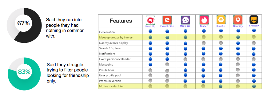
“Meet up groups by interest” and “motive mode filter” were two features I identified that should possibly be added to the Who’s Up app. I chose these because, based on the data collected, 67% of the users seemed to be frustrated by talking to other users and find they had nothing in common with when using these apps. 83% expressed they struggled browsing to find people that were looking to make friends only.
Qualitative and Quantitative User Data
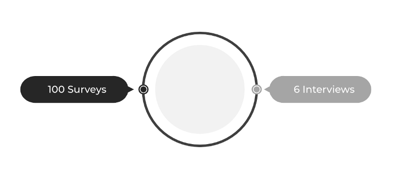
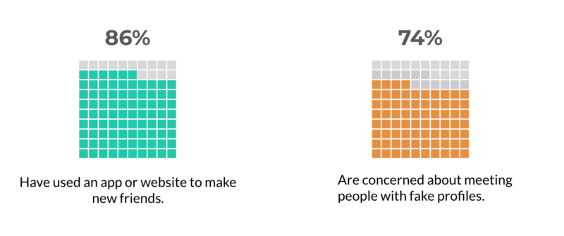
For the user research I had 100 survey responses and 6 interviews. Surveys showed that 86% have used and app or website to make new friends and 74% were concerned about meeting people with fake profiles.
Interviews were a great tool to dig much deeper and get qualitative data by asking “why?” as many times possible. Some of the quotes from the users were:
“I feel those apps are great to meet new people but hard to make real friends”
“ There’s a lot of people out there using fake pictures and fake profiles, it’s scary”
“ I’ve never used an app to meet people online, I’m not from that generation”
“ Miami is a really tough city to meet friends”
“ I travel a lot to new places, I love using apps to meet people around the world”
Affinity Diagram
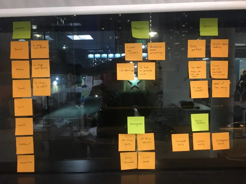
An affinity diagram was used to dissect all the information gathered from those surveys and interviews. I stacked them all by groups, identifying demographic information, gains, pain points and event habits. With this information I was able to create my user persona.
User Persona
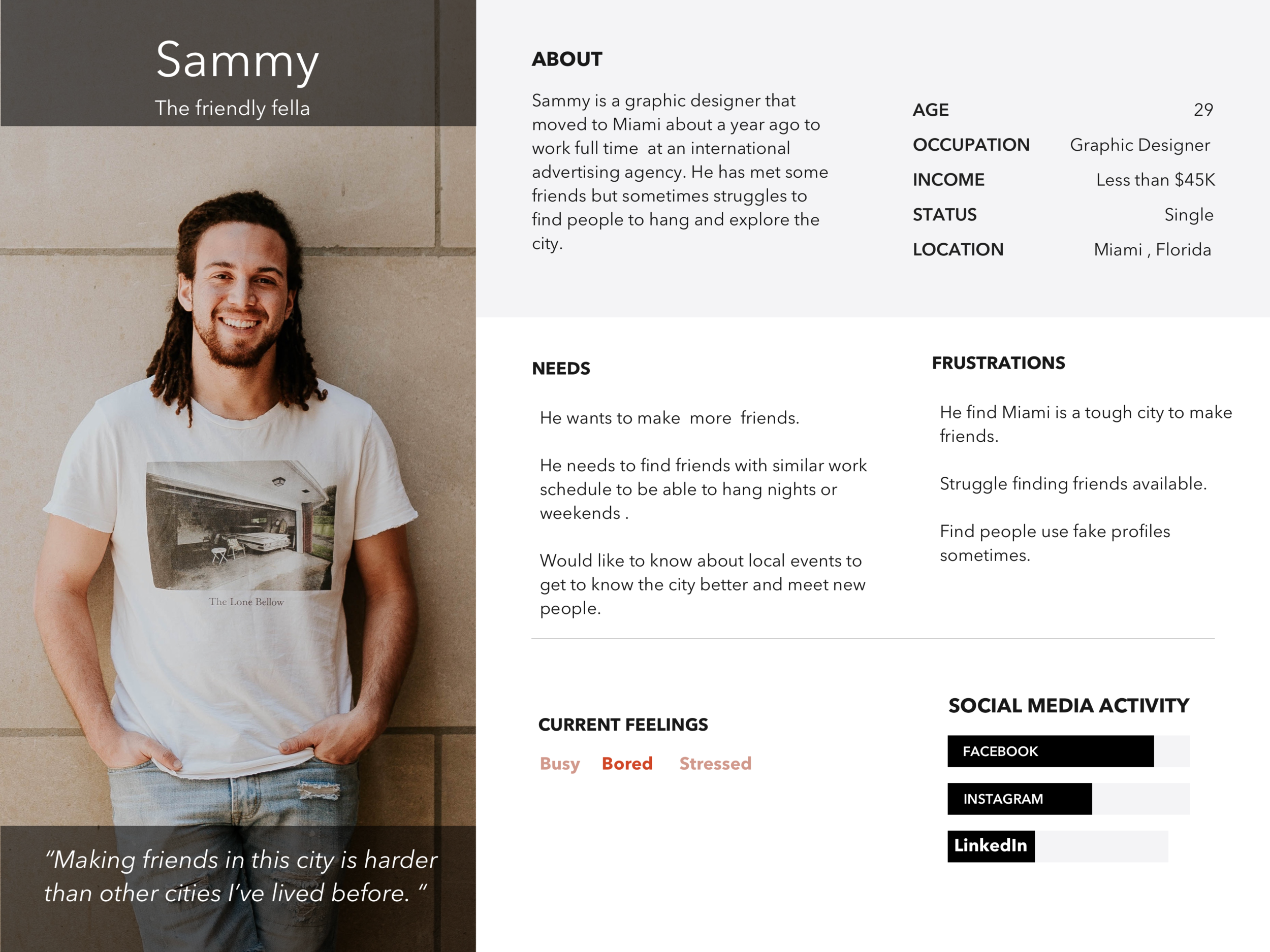
Creating a user persona will help you remember that you are not designing for yourself but for the majority of your target audience. I created Sammy the friendly fella. In here you can see some of his needs and frustrations along with some of his feelings. I even added a real quote from the qualitative data I received.
User Journey
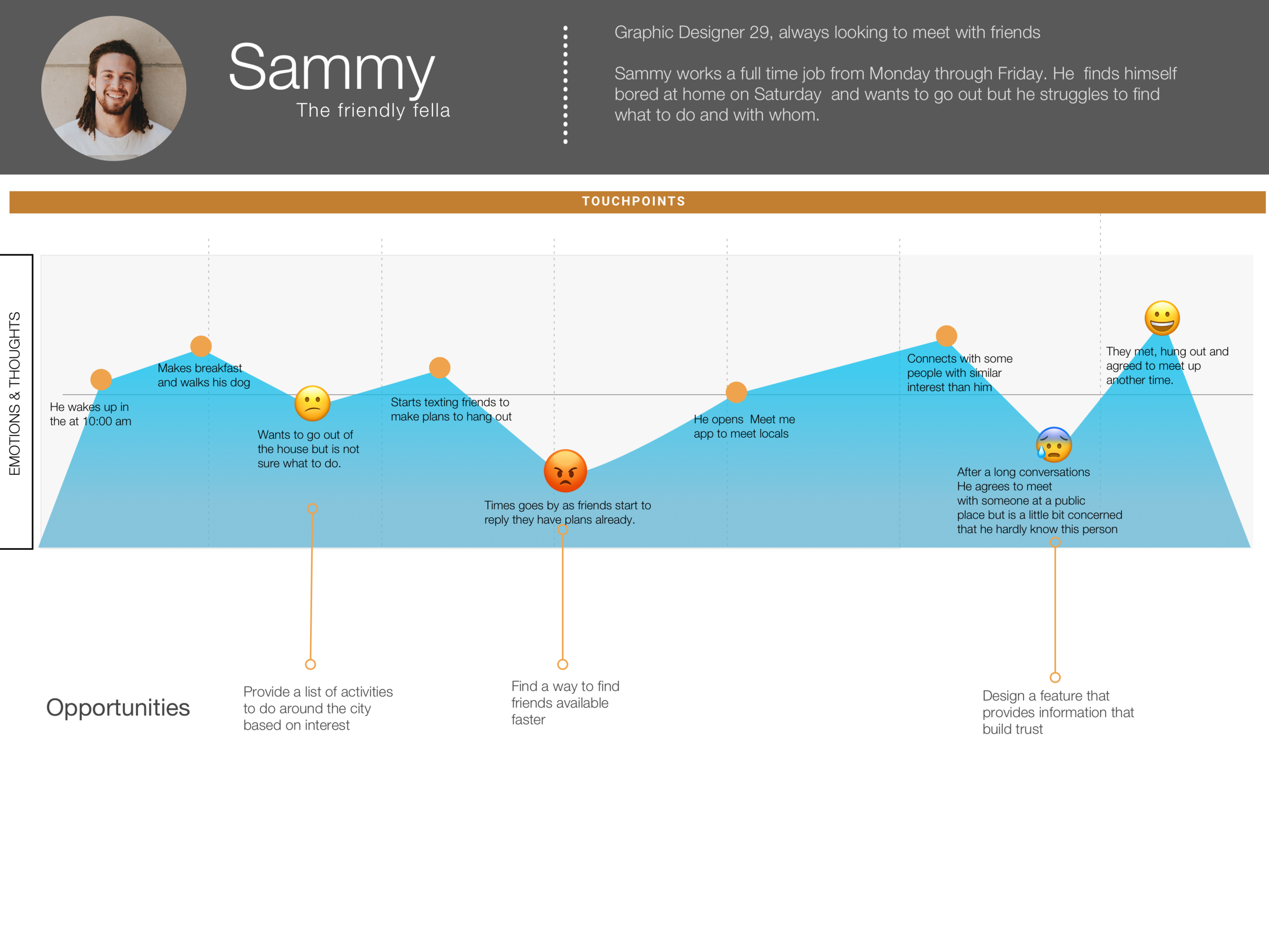
The user journey is basically a representation of a day in Sammy’s life. This user journey was created with information gathered from the quantitative and qualitative data collected during the user research phase. Here I can empathize with my user persona, see his current habits, pinpoint his pain points and come up with opportunities to reduce pain points. Looking at his key pain points I came up with “how might we” statements to find solutions to these opportunities.
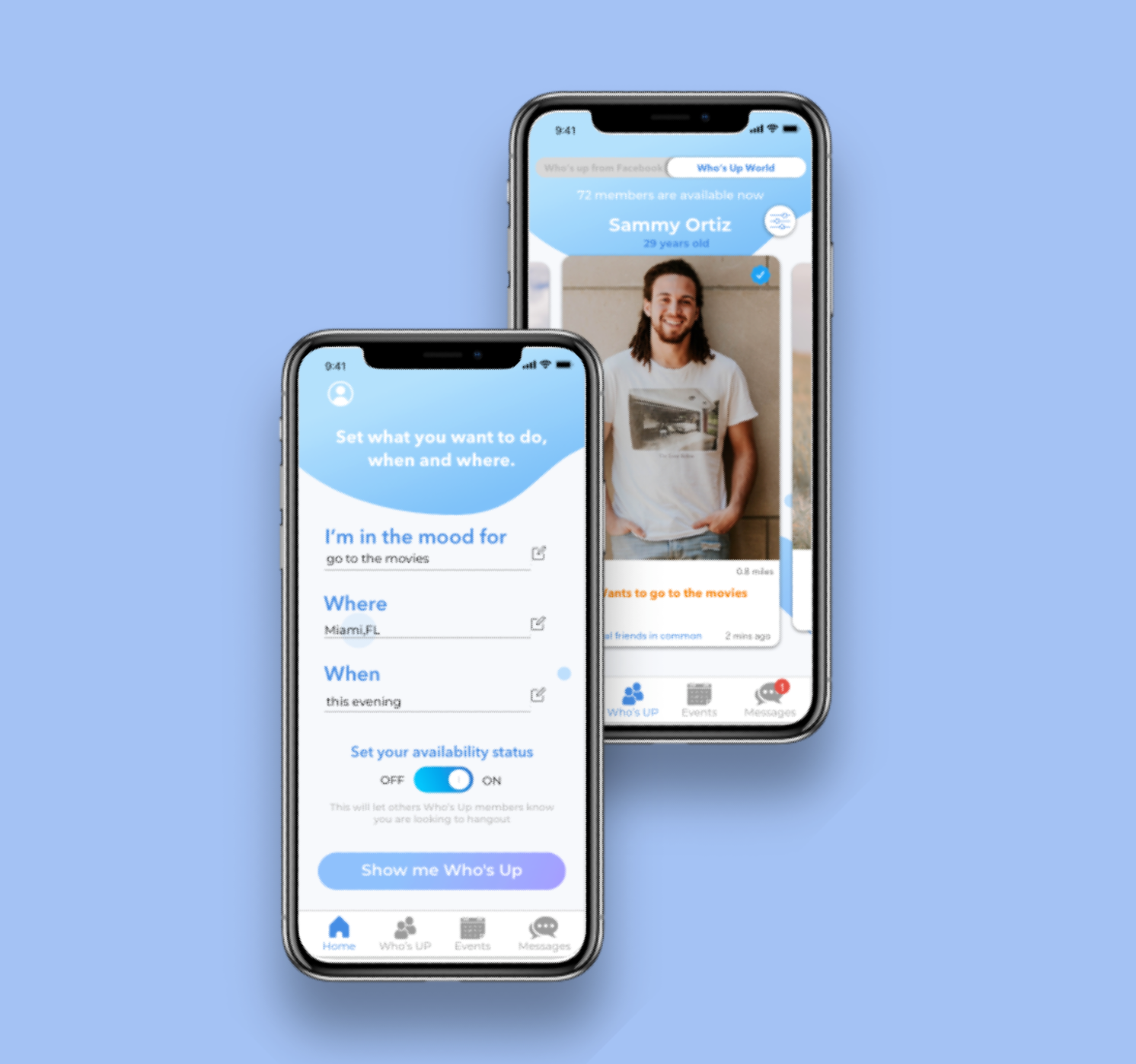
Minimum Viable Product
Some say two heads are better than one. If this is true, imagine what four heads together can achieve! I gathered four of my classmates and started ideating. We looked for solutions for HMW’s statements and started to place them on a feature prioritization chart. We placed the features that were a requirement under the “Must have” and then analyzed those that would have the most impact with the lowest effort.

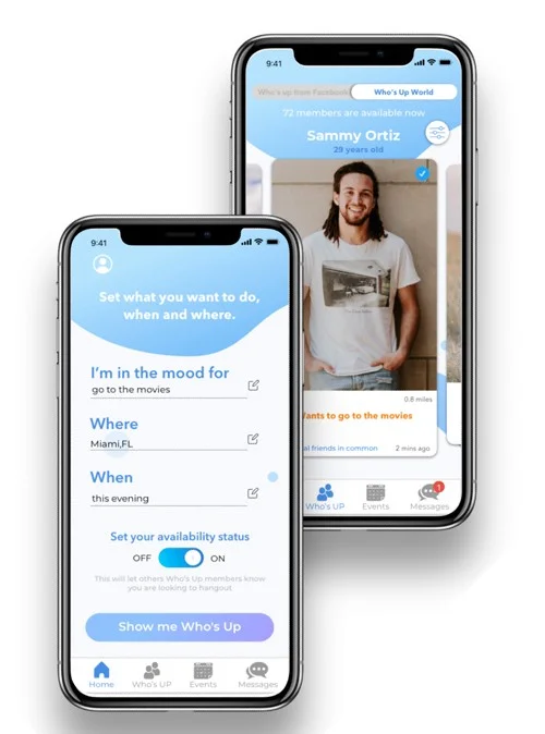
My MVP turned out to be a product that included availability and user verification features.
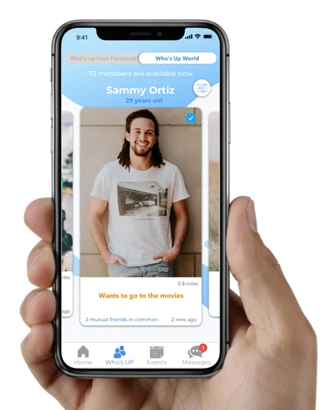
The availability feature will solve users pain point of not having someone to hang out with. It will let other Who’s Up members know if the user is currently looking to hang, where, when and even suggest what he is is the mood for. He will also be able to see other Who’s up members as they tag them selfs as available.
Survey data showed that a key concern with meeting people online is the veracity of user profiles and security. I also thought of creating a way to validate member profiles. When users validate their profile, the app will check their state-issued ID, cell phone number, and a selfie they take from inside the app. For security, Who’s Up won’t store this information. Once users are verified, they will get a special badge on their public profile.
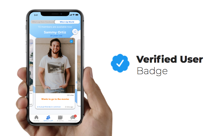
Who’s Up members who login through Facebook will be able to see friends in common with other members. This is another verification element to have since 86% of the users interviewees expressed that seeing friends in common would help them to feel more secure about talking to stranger.
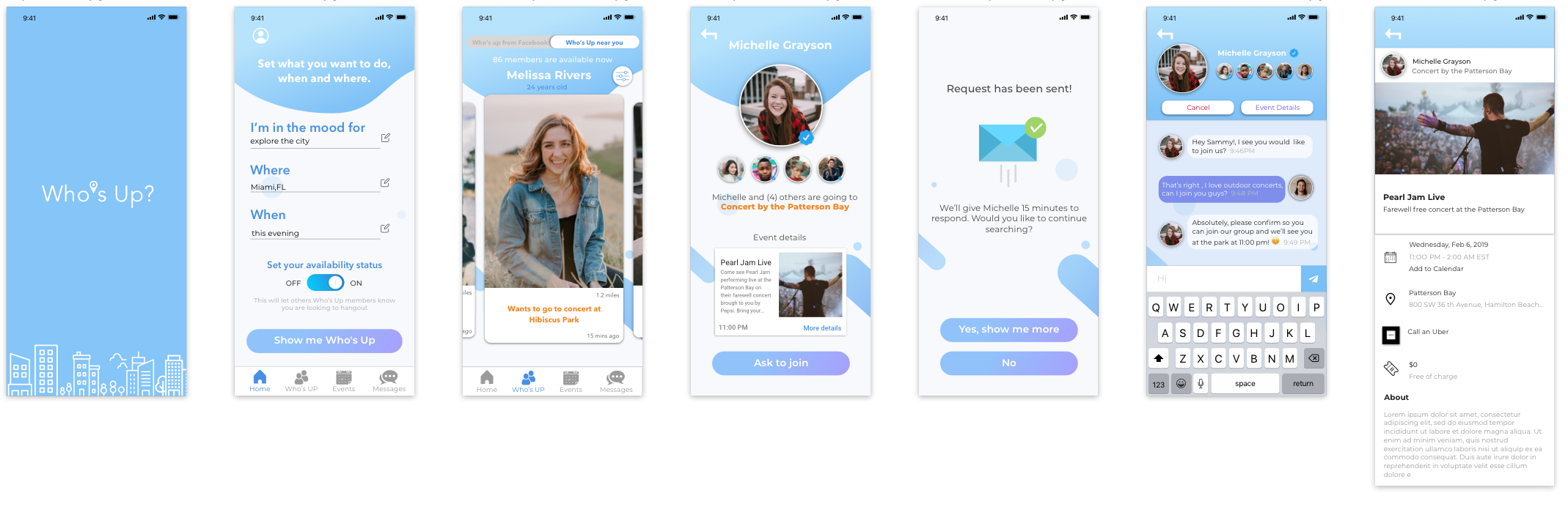
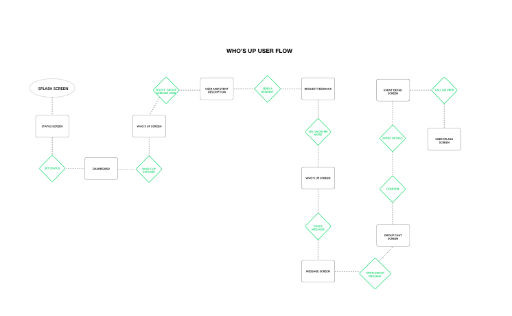
User Flow
After identifying the MVP I created a flowchart diagram. This shows what the happy path for Sammy would be in order to complete the task of making himself available in the app, finding a group of Who’s Up members to hang after being accepted in the group and confirming to go with them to the event.
Prototyping
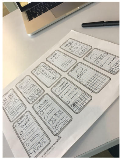
Crazy 8’s
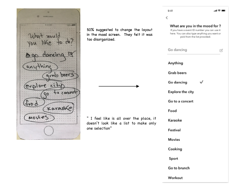
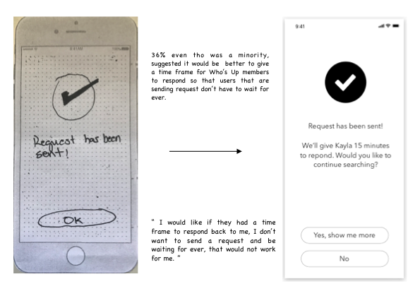
Once the user flow was created, it was time to start prototyping. I started rapid prototyping by doing crazy 8's sketches. I tested with eight users, 63% of which suggested changes on screens like adding buttons and changing layout.
I made all the necessary changes and started testing with my mid-fidelity prototypes using Invision. I did usability testing with the eight users. The completion rate improved after 75% of the users completed the task given in less than two minutes. The task was simple, they had to:
Change their mood choice
Make themselves active
Browse among active Who’s Up members and send a request to join a group to go to concert at the park
Look for received message and confirm to join the group
During this usability testing I took note of feedback and suggestions which I then applied to my hi-fidelity prototypes.
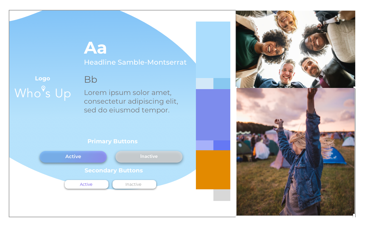
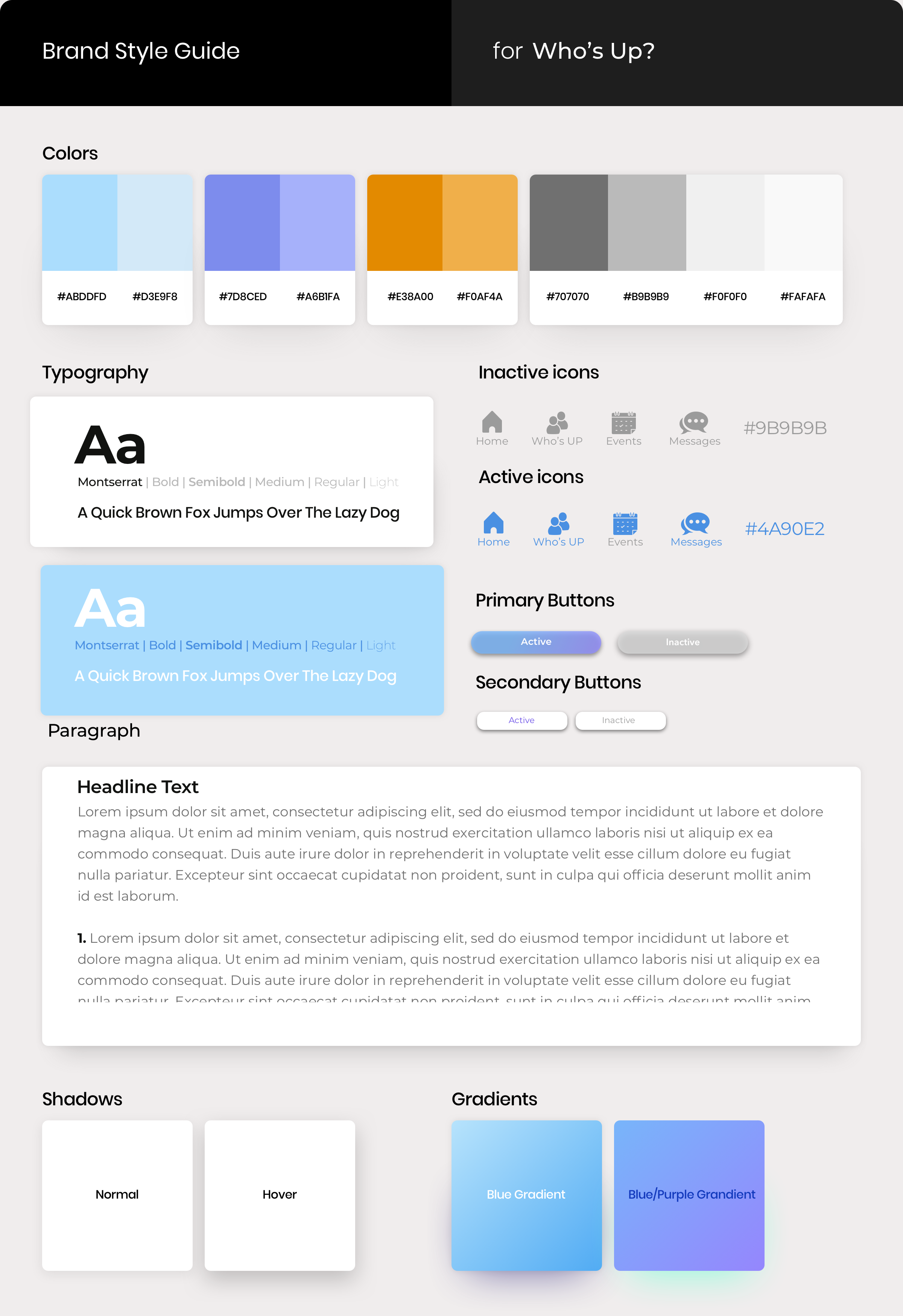
Style Tile & Style Guide
I wanted Who’s Up app to inspire friendliness, security and diversity. So I used the psychology of colors to find those that represented friendliness and security and decided to use blue as my main color. I also selected images and created a moodboard. During desirability testing, the users picked the same brand attributes. I went ahead and created the style tile and started building the style guide for this project.
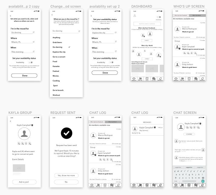
Hi-fidelity Prototype
I designed hi-fidelity prototypes, tested with ten users and discovered other opportunities for change around the task flow. I changed the nav bar from five icons to four after realizing the notification tab was not necessary. I also added a button to access event details from the group chat screen after the user confirms the meet up.
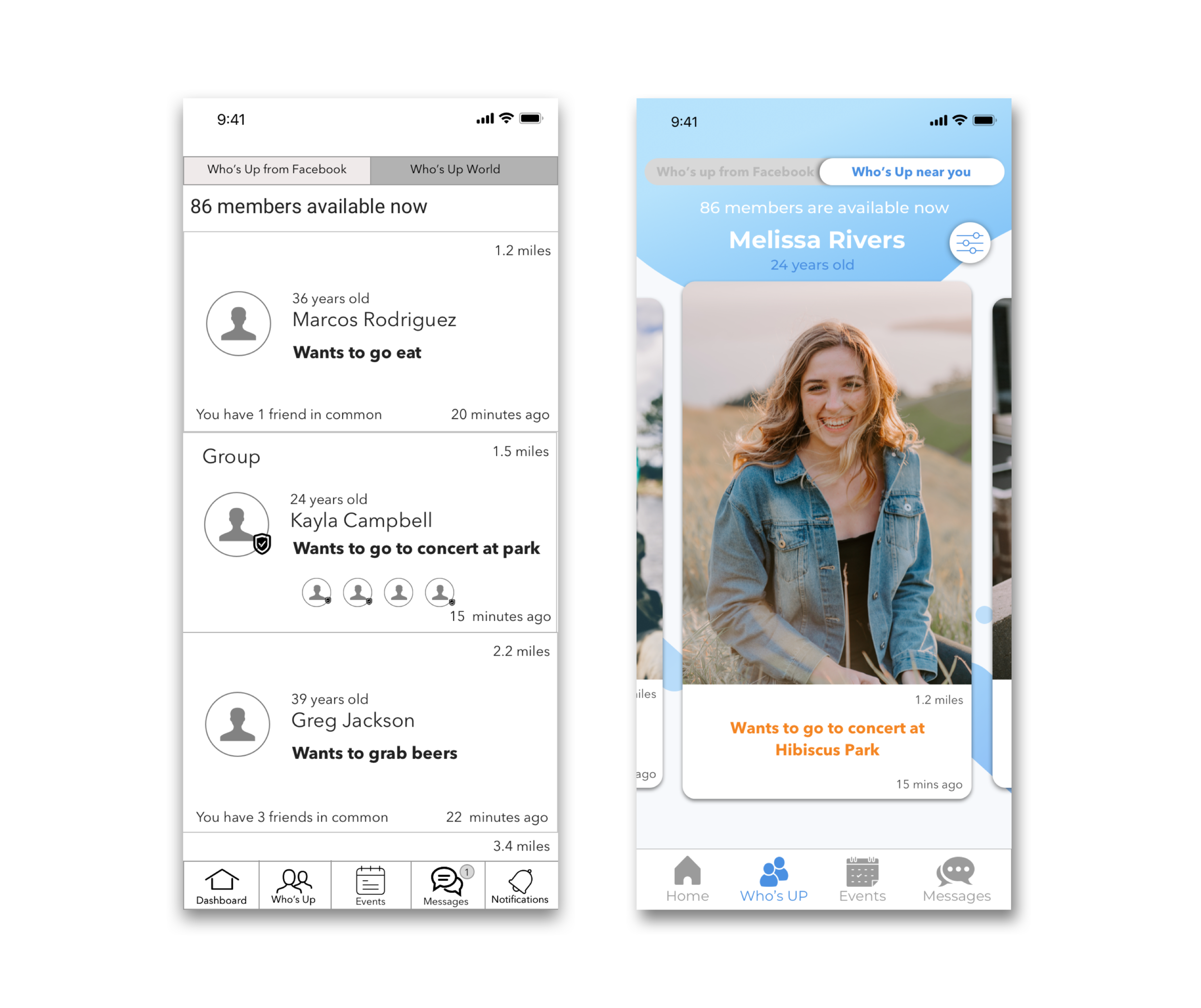
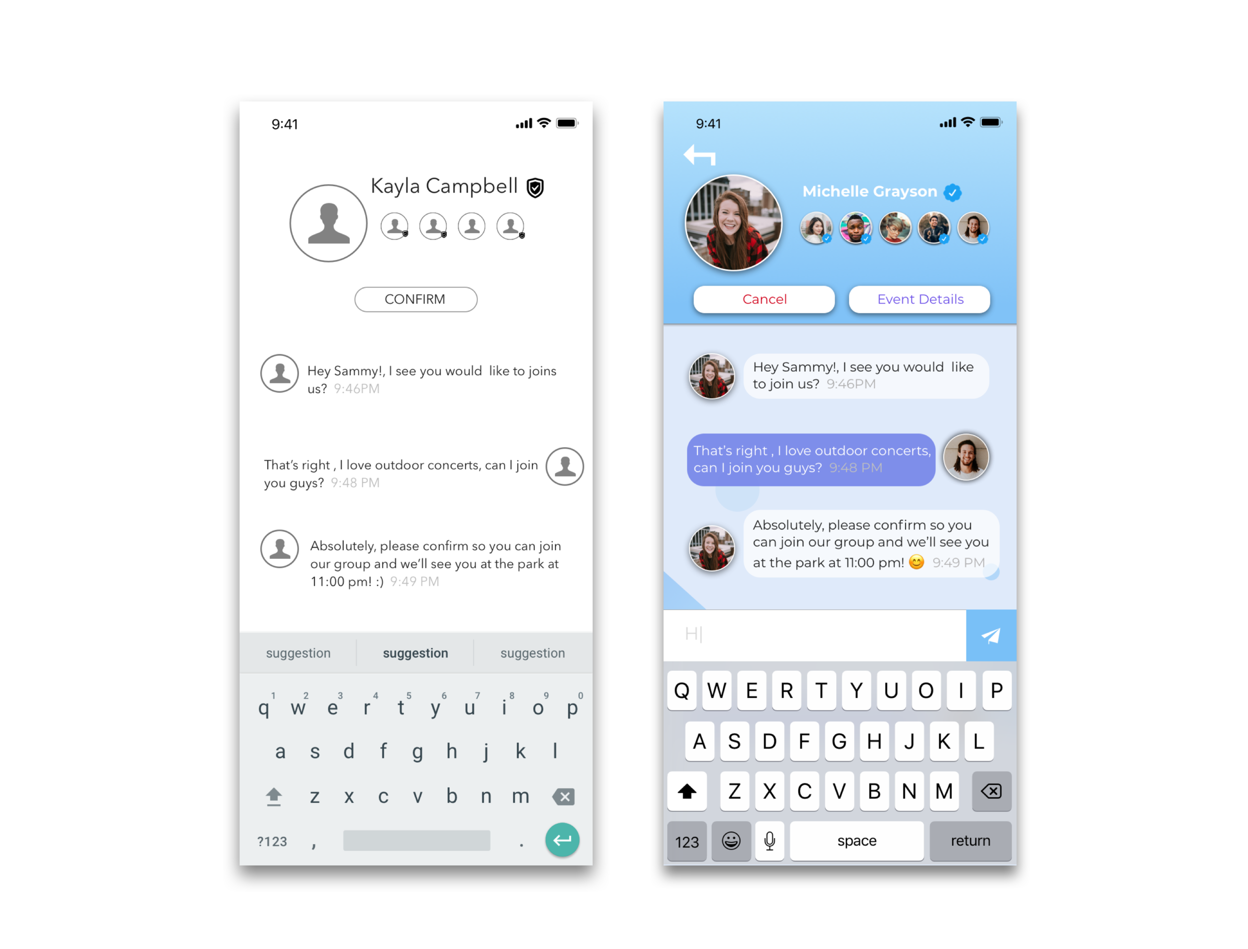
After changes were completed, I was ready to present the happy path using hi-fidelity prototype screens.
Next Steps
Some of the next steps for this project include:
Conduct more research to see if a discreet rating system will improve the user experience.
Develop a feature set in Who’s Up for users exclusively looking to date.
Create exclusive events for Who’s Up premium members.