
Fast Alerts Reimagined: How UX Design Improved Compliance and Reduced Shrink

Overview
As a Product Designer at Kroger, I led the redesign of FAST Alerts, our enterprise-wide temperature monitoring tool. The application helps store leaders, food safety managers, and technicians ensure food safety and quality by monitoring cooler temperatures in real-time.
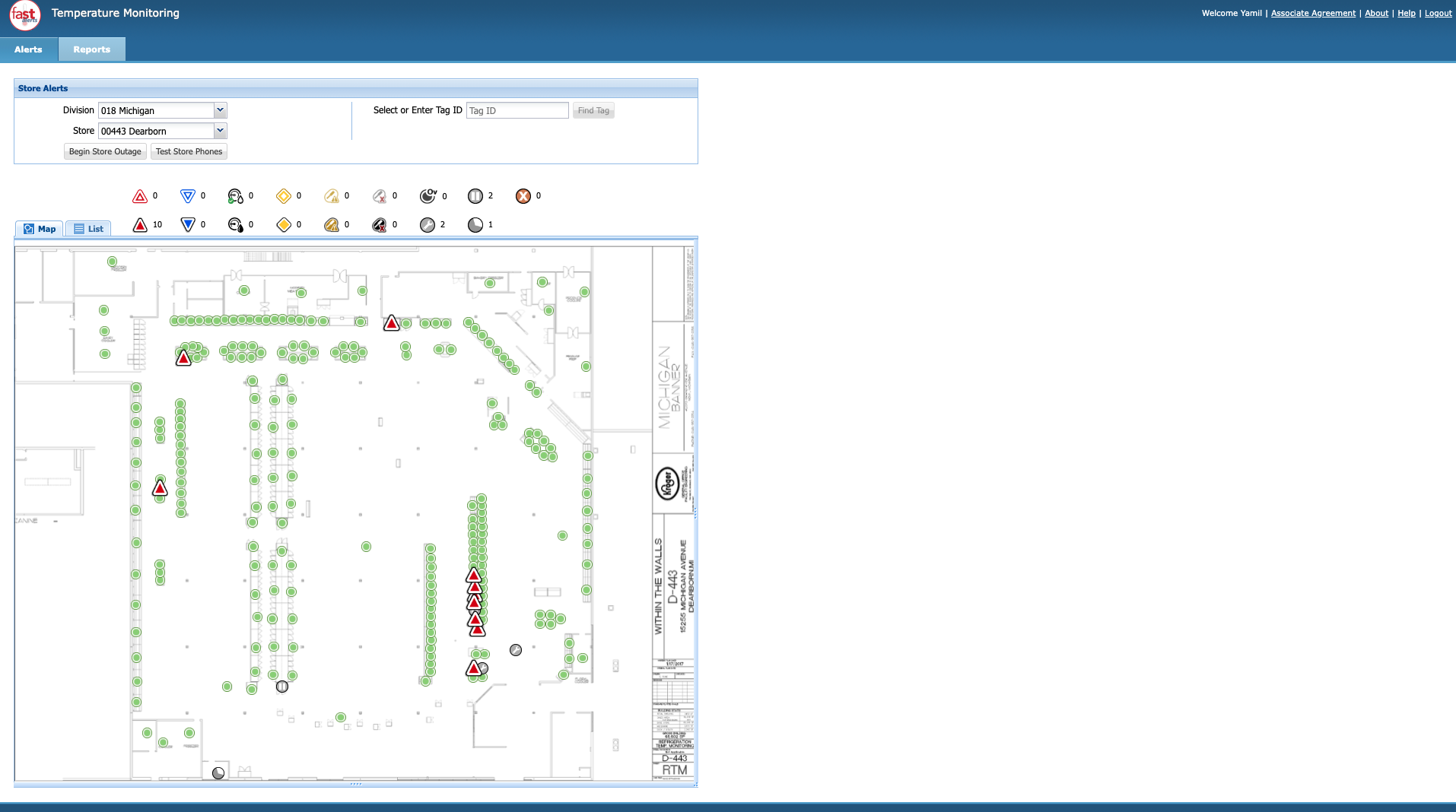
The legacy tool had confusing workflows, lacked urgency indicators, and failed to drive the desired behavior. As a result, Kroger was losing millions of dollars annually in wasted perishable goods and energy inefficiencies.
My Role
UX/UI Design: Redesigned workflows, alert hierarchy, and visuals using Kroger’s Design System.
User Research: Interviewed Store Leaders, Food Safety Managers, and Technicians.
Workshop Facilitation: Aligned stakeholders on the need for modernization.
Prototyping & Testing: Iterated designs based on usability sessions.
Collaboration: Partnered with engineers to implement scalable solutions.
The Alert Acknowledgement Process
The Problem
Store leaders are not consistently responding to temperature alerts in a timely manner. The lack of clear urgency indicators, combined with confusing workflows that require excessive clicks and steps, has led to critical issues being overlooked or unresolved. As a result, Kroger was losing millions of dollars annually in wasted perishable goods and energy inefficiencies.
Perishable shrink from uninsured product loss.
Increased energy waste due to unresolved cooler issues.
Elevated food safety risks, threatening compliance and customer trust.
Estimated annual loss: $5M+ in perishable shrink and $1M in energy costs caused by delayed responses.
Research & Discovery

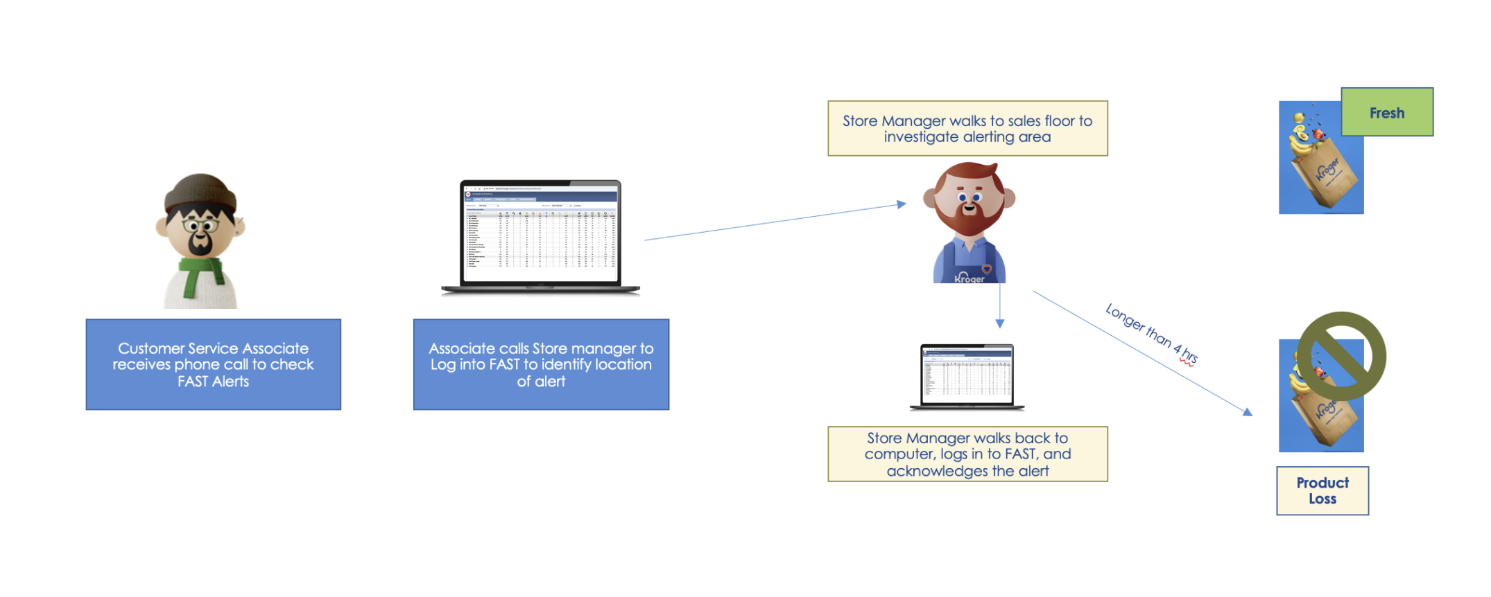
I conducted stakeholder interviews with Store Leaders, Food Safety Managers, and Technicians to understand why alerts were being missed.
I also facilitated workshops with our users to uncover user pain points and align on the challenges. During this process we identified the following gaps:
No urgency signals
Unclear priorities
Slow response times
Consfusing workflows


The team also chose to modernize the codebase and refresh the user interface, while optimizing user interaction with temperature alerts to help reduce waste costs.


Developed updated user personas for our primary user groups to capture goals, behaviors, and challenges.
Created a service blueprint to fill gaps in understanding and visualize the end-to-end FAST Alerts system.

Design & Iteration
Refreshed UI with Kroger Design System for consistency and accessibility.
Simplified navigation and workflows to reduce cognitive load.
Partnered with engineering to modernize the system architecture for speed and stability.


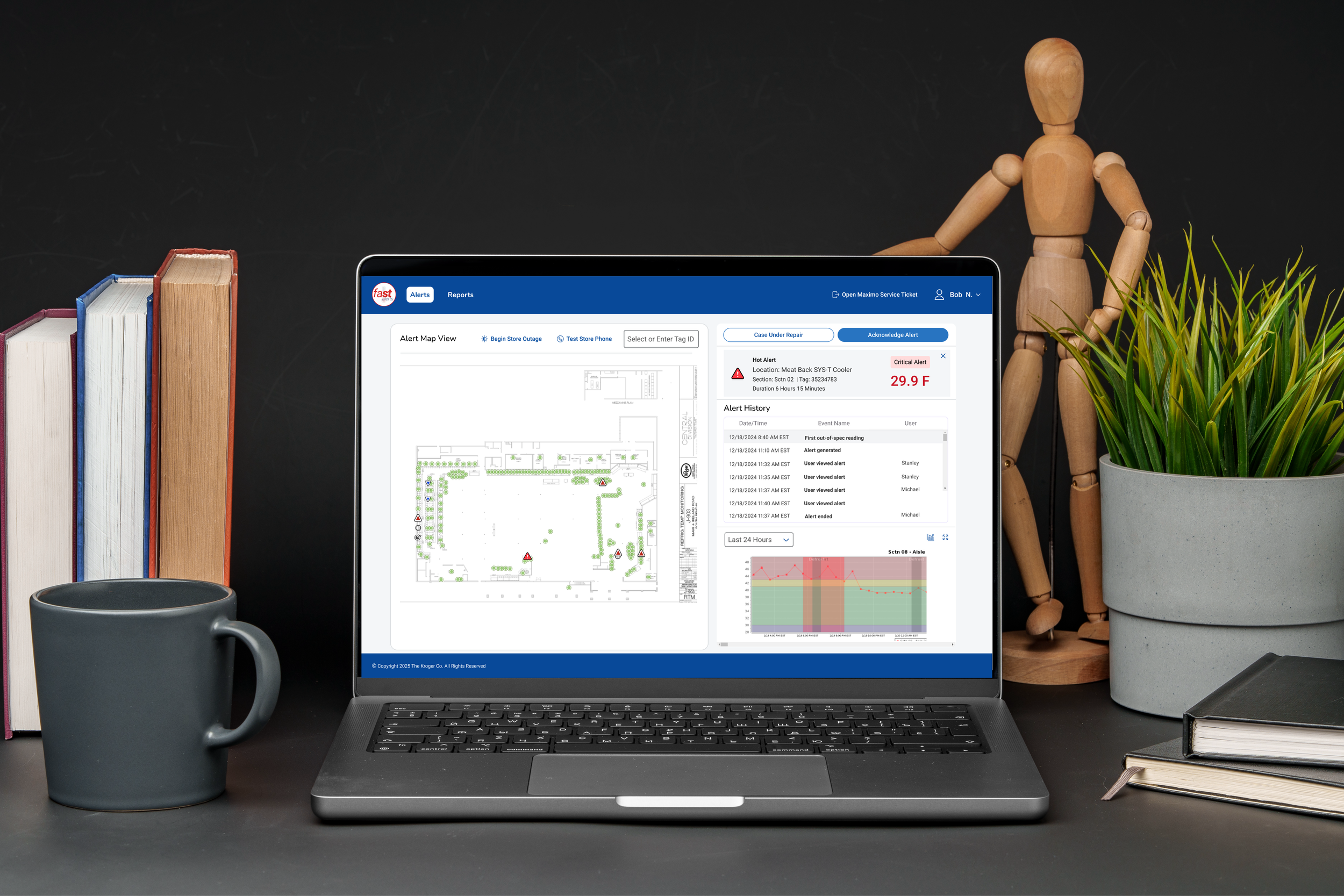
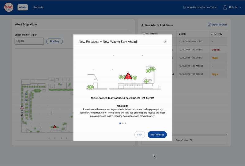
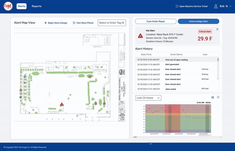
3. Introduced Critical Alerts — a new alert type triggered as events approach the 4-hour mark, helping users quickly identify and prioritize the most urgent issue
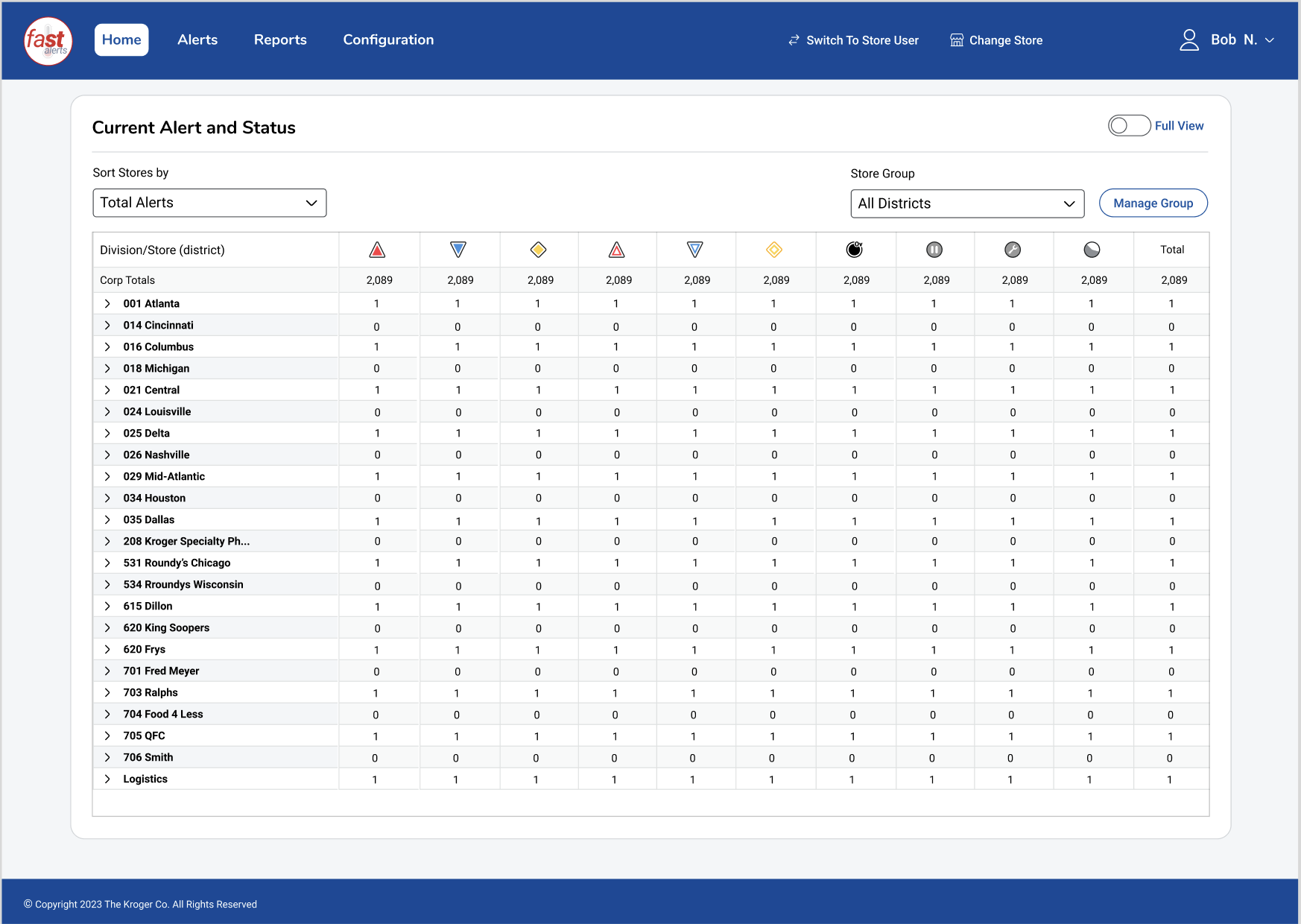
4. Holistic Alert View — A redesigned layout that places the alert list directly beside the store map, giving leaders a complete picture at a glance. Clear urgency indicators ,through color coding and intuitive icons, making it easier to spot and act on critical issues faster.

5. Redesigned alert details — Introduced a side-by-side layout that gives users an immediate, comprehensive view of the event, making it easier to understand the full context at a glance.

6. I redesigned the navigation by removing the side menu, creating more screen real estate for core tasks. We also streamlined the menu structure by eliminating unused report items, reducing clutter and helping users focus on the most relevant actions.


Mobile Notification

7. Alongside the new Critical Alerts UI, we introduced real-time notifications to store leaders’ TC-52 devices. This ensures they’re instantly alerted to the most important events, enabling faster action and reducing response delays.
Testing & Feedback
1. I iterated based on user feedback by making alert states clearer, adding more detailed alert information, and repositioning CTAs. Usability testing revealed that some users struggled to locate actions due to monitor size, so we adjusted placement for better visibility and accessibility.

2. Users shared that to properly acknowledge an alert, they sometimes needed to review the temperature graph in more detail, even going back a few days. To support that, we added a Temperature Graph ‘snapshot’ with quick controls so they can adjust time frames while keeping the graph on screen, making acknowledgements faster and easier.

The Outcome
Success Metrics
Faster Alert Acknowledgment: Store leaders acknowledged alerts 30% faster due to streamlined UI and clearer workflows.
Reduced Cost : By reducing delayed responses to temperature excursions, the system helped decrease perishable shrink costs from $5M annually to $3.3M, and lowered energy costs by an additional $300K through consistent enforcement of FAST behaviors.
Improved System Response Time: Pages and data load times improved by 50%, cutting frustration and delay.
User Adoption & Satisfaction: Post-launch survey showed 85% of users preferred the new design over the legacy version.
Key Learnings
Modernizing a legacy tool requires balancing technical constraints with user needs.
Direct user research was critical in uncovering workflows that weren’t visible from a technical perspective.
Success wasn’t just about a new look, but also performance, reliability, and scalability.
Next Steps
Store Map Visualization – Explore component libraries and technical solutions to deliver a more intuitive, real-time map view of store equipment and alerts.


Mobile Application Launch – Roll out the FAST Alerts mobile app on TC-52 devices, enabling store leaders to receive and act on alerts wherever they are.